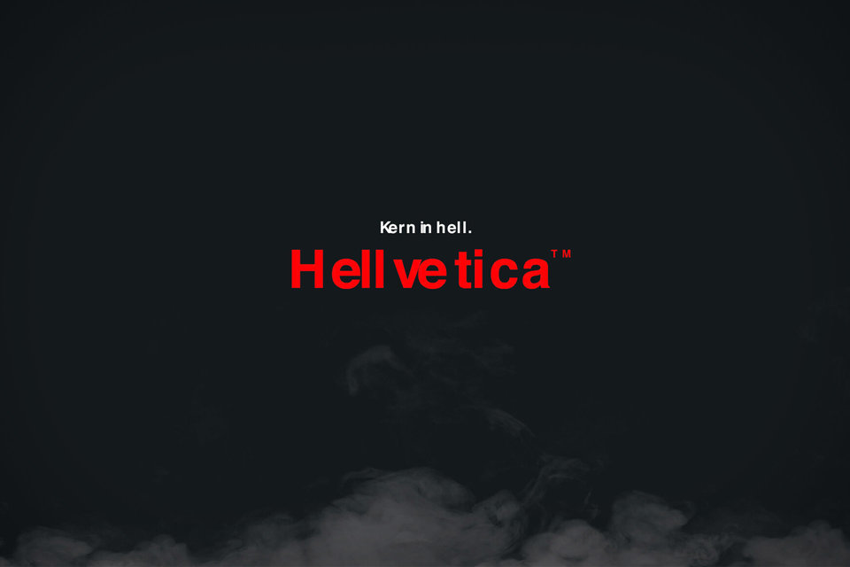
Hellvetica: Beyond Bad Kerning – A Complete Resource
Designers know kerning can make or break a typeface—but what happens when bad kerning becomes the star? Enter Hellvetica, the viral font that’s equal parts hilarious and horrifying. Born as a parody of Helvetica Now’s 2019 revamp, this intentionally botched typeface has become a cult favorite for Halloween campaigns, meme culture, and design rebels. Whether you’re here to download Hellvetica for a spooky project, decode its chaotic design logic, or explore its unexpected creative applications, this guide has you covered.
Quick bullets:
- Download Hellvetica font: Grab it from official mirrors or trusted font managers.
- Decode its design: A masterclass in kerning gone rogue.
- Design use cases: From event posters to branding stunts, see how others wield this “anti-font.”
Instant Download Links
Ready to dive into the chaos? Here’s how to install Hellvetica without the hassle:
Official sources:
- Hellvetica’s GitHub repository (direct download)
- Design forums like Behance and Creative Bloq often host updated mirrors.
Font managers we trust:
- FontBase (free, lightweight)
- Adobe Fonts (for seamless Creative Cloud integration)
Installation guide:
- Windows: Unzip > Right-click .ttf file > Install.
- Mac: Use Font Book > Add Fonts.
- Web: Host the font files locally or via Google Fonts alternatives.
Pro tip: Pair Hellvetica with a horror display font like BLOOD for maximum Halloween vibes.
From Helvetica Now to Hellvetica
In 2019, Monotype’s Helvetica Now aimed to perfect the iconic typeface. But R/GA’s designers saw an opportunity for mischief. Tasked with a Halloween campaign, they hacked Helvetica’s DNA, warping its kerning and spacing algorithmically. The result? A font that feels “like Helvetica’s evil twin,” as one Reddit user put it.
Why it resonates:
- Parody as critique: Hellvetica exposes how subtle tweaks can unravel a typeface’s soul.
- Viral design stunts: Its intentional flaws make it perfect for memes, horror themes, and branding stunts.
Five Creative Ways to Use Hellvetica
- Halloween event posters: Pair with splatter textures for a haunted vibe.
- Social media graphics: Use animated glitches to amplify its unease.
- Branding stunts: A coffee shop rebranded as “Hellbrew” for October.
- Album covers: Brooklyn band The Kerning Dead used it for their punk EP.
- UI pranks: Swap your app’s font on April Fools’ Day (user discretion advised).
Ensuring Legibility and Inclusivity
Hellvetica’s charm is its illegibility—but accessibility still matters.
- WCAG contrast: Use it sparingly; pair with high-contrast backgrounds.
- Alt-text: Describe its intent (e.g., “intentionally distorted text for Halloween theme”).
- Mobile readability: Avoid body text; stick to headlines under 20 words.
Legal Side of Viral Typefaces
Hellvetica is free for personal use, but commercial projects need caution:
- Attribution: Credit R/GA in client deliverables.
- Fair use: Parody protects it, but don’t slap it on merch without legal counsel.
What Designers Are Saying
- “Using Hellvetica feels like releasing your inner design gremlin.” – Reddit user
- “It’s the perfect antidote to sterile minimalism.” – Twitter user
The Horror Effect: Why We Love to Hate Bad Kerning
Hellvetica taps into our brain’s need for order. Gestalt principles explain why uneven spacing feels unsettling—it breaks the “law of similarity.” Yet, that discomfort is why it’s unforgettable in emotional branding.
Top 7 Free Spooky Fonts of 2025
- Dreadful: Jagged edges meets Victorian elegance.
- BLOOD: Dripping horror for posters.
Pairing tip: Balance Hellvetica with clean sans-serifs like Inter for contrast.
The Next Frontier: Algorithmic Horror Type
Generative AI tools like FontJoy are creating fonts that “evolve” as you type. Imagine Hellvetica 2.0, where each letter’s spacing reacts to your cursor’s movement—true interactive terror.
Your Hellvetica Toolkit
- Download: Hellvetica GitHub
- Get inspired: D&AD Case Study
- Go deeper: Smashing Magazine’s guide to typography psychology.

